Survey Creator UI Customization in SurveyJS v2.0
SurveyJS has just released its major v2.0 update, bringing multiple improvements primarily focused on the Survey Creator component. This update introduced powerful new features designed to enhance usability, simplify navigation and rearrangement of survey elements, and provide an even more intuitive survey-building experience.
In the first part of our SurveyJS v2.0 overview, we explored some of these new features in detail, covering improvements such as the enhanced page menu, survey tree search and nagivation, new Property Grid view, and much more. If you haven’t read it yet, check it out here: Survey Creator v2.0 - What's New.
This second part is dedicated to a new settings panel for UI customization that allows users to adjust the Survey Creator UI to match their own preferences and requirements. Let's dive into the new customization options.
New UI Themes
Survey Creator v2.0 introduces three new pre-built themes:
Light (default) – A clean and modern design based on SurveyJS brand colors.
Dark – A sleek, high-contrast theme ideal for low-light environments.
Contrast – A theme designed for enhanced accessibility, with WCAG 2.2-compliant primary and secondary colors.
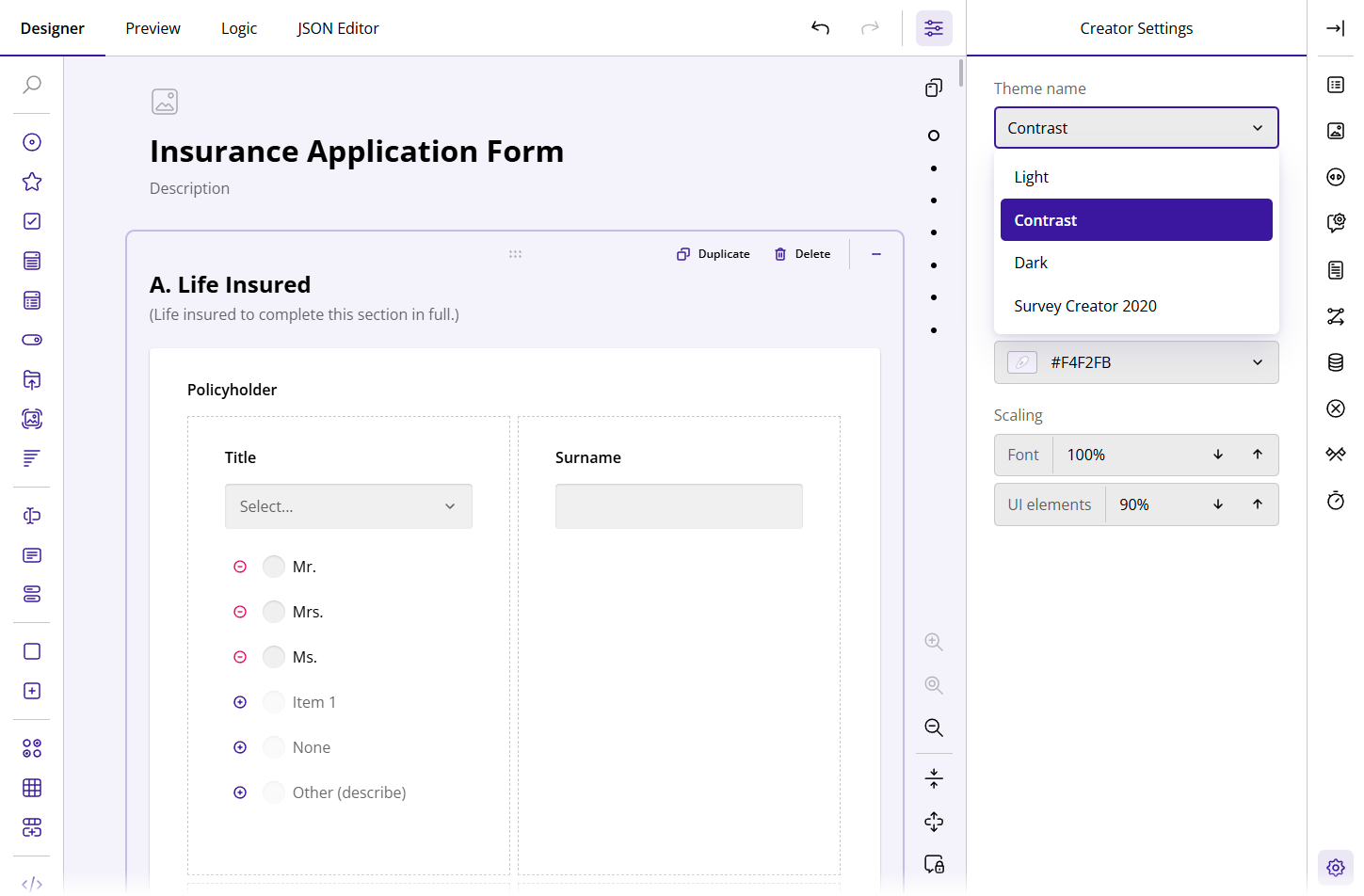
Previously, users had to rely on their development teams to customize the form builder UI to match their preferences. With the introduction of predefined themes, easily accessible through a dedicated UI customization panel, users now have an out-of-the-box selection of themes that can be further customized to suit their needs.
Watch Video
View Appearance Customization Demo
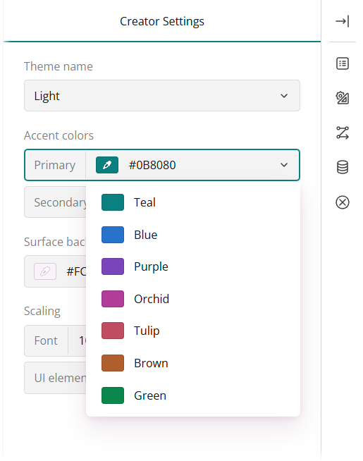
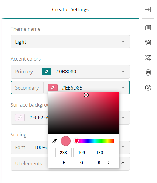
Adjustable Accent Colors
Users now have more control over the color scheme of the Survey Creator UI. The new Accent colors settings allow customization of primary and secondary colors using the color pickers or by entering a color code in RGB, HEX, or HSL. With these options, users can create a fully personalized UI that aligns with their brand identity or aesthetic preference.
Primary Color
The primary color is the dominant color used throughout the Survey Creator UI. Now, users can set their preferred primary color, and the form background (surface) color will automatically adjust to complement it.
Watch Video
Secondary Color
The secondary color is used to accentuate the UI components a user interacts with, such as selected or hovered-over elements. Users can customize the secondary color to further complement the primary color and align the UI with their design preferences.
Watch Video
View Appearance Customization Demo
Scaling
Survey Creator v2.0 introduces new scaling options to ensure that users create a UI layout that best suits their screen size, workflow, and personal preferences. Users can now increase text size for better readability or reduce text size to maximize screen space and display more settings at once.
Watch Video
In addition to text scaling, users can also resize key UI components—Property Grid, Toolbox, Tab Bar—using a single setting to improve usability.
Watch Video
Conclusion
With these new UI customization options, Survey Creator v2.0 is more flexible than ever before. Whether you prefer a light or dark theme, need high-contrast colors for accessibility, or want to fine-tune text and UI scaling, you can now tailor the form builder UI to match your exact needs - all directly within the Designer tab, without needing assistance from your development team.