Theme Adapters for Bootstrap, MUI, shadcn/ui, and Tailwind CSS
In addition to its predefined themes, SurveyJS includes theme adapters for popular UI frameworks and design systems.
A theme adapter is a lightweight stylesheet that maps SurveyJS design tokens to framework-specific styles and provides additional styles for SurveyJS UI components that the framework does not provide. It makes SurveyJS components match the look and feel of your application without custom CSS.
SurveyJS provides theme adapters for Bootstrap, MUI, shadcn/ui, and Tailwind CSS v4 out of the box.
Bootstrap
The Bootstrap theme adapters apply Bootstrap's typography, colors, spacing, and form control styles to SurveyJS components, making surveys appear as a natural part of Bootstrap-based applications. SurveyJS provides an adapter for standard Bootstrap and separate adapters for supported Bootswatch themes.

Load the core SurveyJS stylesheet followed by one adapter stylesheet that matches your application's Bootstrap or Bootswatch theme. Use bootstrap-default.css for standard Bootstrap. Then call setupThemeAdapter("bootstrap") once during application initialization to align form layout defaults and Survey Creator options with Bootstrap.
// Modular applications
import { setupThemeAdapter } from "survey-core";
import "survey-core/survey-core.css";

// Choose one adapter stylesheet
import "survey-core/themes/adapters/bootstrap-default.css";
// import "survey-core/themes/adapters/bootstrap-cosmo.css";
// import "survey-core/themes/adapters/bootstrap-darkly.css";
// import "survey-core/themes/adapters/bootstrap-flatly.css";
// import "survey-core/themes/adapters/bootstrap-litera.css";
// import "survey-core/themes/adapters/bootstrap-lux.css";
// import "survey-core/themes/adapters/bootstrap-morph.css";
// import "survey-core/themes/adapters/bootstrap-zephyr.css";

setupThemeAdapter("bootstrap");
<!-- Classic script applications -->
<link href="https://unpkg.com/survey-core/survey-core.min.css" rel="stylesheet">
<!-- Choose one adapter stylesheet -->
<link href="https://unpkg.com/survey-core/themes/adapters/bootstrap-default.min.css" rel="stylesheet">
<!-- Other Bootstrap themes:
<link href="https://unpkg.com/survey-core/themes/adapters/bootstrap-cosmo.min.css" rel="stylesheet">
<link href="https://unpkg.com/survey-core/themes/adapters/bootstrap-darkly.min.css" rel="stylesheet">
<link href="https://unpkg.com/survey-core/themes/adapters/bootstrap-flatly.min.css" rel="stylesheet">
<link href="https://unpkg.com/survey-core/themes/adapters/bootstrap-litera.min.css" rel="stylesheet">
<link href="https://unpkg.com/survey-core/themes/adapters/bootstrap-lux.min.css" rel="stylesheet">
<link href="https://unpkg.com/survey-core/themes/adapters/bootstrap-morph.min.css" rel="stylesheet">
<link href="https://unpkg.com/survey-core/themes/adapters/bootstrap-zephyr.min.css" rel="stylesheet">
-->
<script src="https://unpkg.com/survey-core/survey.core.min.js"></script>
<script>
  Survey.setupThemeAdapter("bootstrap");
</script>
Material UI (MUI)
The Material UI (MUI) theme adapter aligns SurveyJS components with your application's MUI theme, including typography, colors, spacing, and component styling.

Load the core SurveyJS stylesheet followed by the MUI adapter stylesheet. Then call setupThemeAdapter("mui") once during application initialization to align form layout defaults and Survey Creator options with MUI.
// Modular applications
import { setupThemeAdapter } from "survey-core";
import "survey-core/survey-core.css";
import "survey-core/themes/adapters/mui.css";

setupThemeAdapter("mui");
<!-- Classic script applications -->
<link href="https://unpkg.com/survey-core/survey-core.min.css" rel="stylesheet">
<link href="https://unpkg.com/survey-core/themes/adapters/mui.min.css" rel="stylesheet">
<script src="https://unpkg.com/survey-core/survey.core.min.js"></script>
<script>
  Survey.setupThemeAdapter("mui");
</script>
shadcn/ui
The shadcn/ui theme adapters make SurveyJS components match the visual style of your shadcn/ui application. Because shadcn/ui supports multiple visual styles, SurveyJS provides a separate adapter for each one.

Load the core SurveyJS stylesheet followed by one adapter stylesheet for your application's visual style. Then call setupThemeAdapter("shadcn") once during application initialization to align form layout defaults and Survey Creator options with shadcn/ui.
// Modular applications
import { setupThemeAdapter } from "survey-core";
import "survey-core/survey-core.css";

// Choose one adapter stylesheet
import "survey-core/themes/adapters/shadcn-base-default.css";
// import "survey-core/themes/adapters/shadcn-new-york.css";
// import "survey-core/themes/adapters/shadcn-base-luma.css";
// import "survey-core/themes/adapters/shadcn-base-lyra.css";
// import "survey-core/themes/adapters/shadcn-base-maia.css";
// import "survey-core/themes/adapters/shadcn-base-mira.css";
// import "survey-core/themes/adapters/shadcn-base-nova.css";
// import "survey-core/themes/adapters/shadcn-base-rhea.css";
// import "survey-core/themes/adapters/shadcn-base-sera.css";
// import "survey-core/themes/adapters/shadcn-base-vega.css";

setupThemeAdapter("shadcn");
<!-- Classic script applications -->
<link href="https://unpkg.com/survey-core/survey-core.min.css" rel="stylesheet">
<!-- Choose one adapter stylesheet -->
<link href="https://unpkg.com/survey-core/themes/adapters/shadcn-base-default.min.css" rel="stylesheet">
<!-- Other visual styles:
<link href="https://unpkg.com/survey-core/themes/adapters/shadcn-new-york.min.css" rel="stylesheet">
<link href="https://unpkg.com/survey-core/themes/adapters/shadcn-base-luma.min.css" rel="stylesheet">
<link href="https://unpkg.com/survey-core/themes/adapters/shadcn-base-lyra.min.css" rel="stylesheet">
<link href="https://unpkg.com/survey-core/themes/adapters/shadcn-base-maia.min.css" rel="stylesheet">
<link href="https://unpkg.com/survey-core/themes/adapters/shadcn-base-mira.min.css" rel="stylesheet">
<link href="https://unpkg.com/survey-core/themes/adapters/shadcn-base-nova.min.css" rel="stylesheet">
<link href="https://unpkg.com/survey-core/themes/adapters/shadcn-base-rhea.min.css" rel="stylesheet">
<link href="https://unpkg.com/survey-core/themes/adapters/shadcn-base-sera.min.css" rel="stylesheet">
<link href="https://unpkg.com/survey-core/themes/adapters/shadcn-base-vega.min.css" rel="stylesheet">
-->
<script src="https://unpkg.com/survey-core/survey.core.min.js"></script>
<script>
  Survey.setupThemeAdapter("shadcn");
</script>
Tailwind CSS v4
The Tailwind CSS v4 theme adapter applies a common Tailwind form layout to SurveyJS components, with compact controls, small body text, and rounded corners. It reads your application's Tailwind theme variables, including --spacing, --font-sans, --text-*, and --radius-*, to match its typography and spacing.
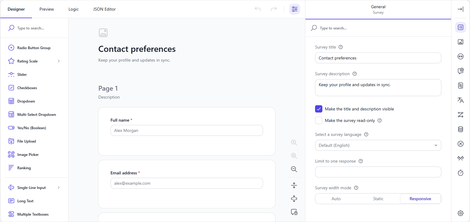
To use the Tailwind CSS v4 theme adapter, import or reference its CSS file after the SurveyJS core stylesheet:
// Modular applications
import "survey-core/survey-core.css";
import "survey-core/themes/adapters/tailwind4.css";
<!-- Classic script applications -->
<link href="https://unpkg.com/survey-core/survey-core.min.css" rel="stylesheet">
<link href="https://unpkg.com/survey-core/themes/adapters/tailwind4.min.css" rel="stylesheet">
The adapter uses the following semantic color variables when your application defines them:
| Variable | Purpose | Default |
|---|---|---|
--color-primary |
Primary actions and selected controls | SurveyJS teal (#19b394) |
--color-primary-hover |
Primary action hover color | A darker shade of the primary color |
--color-primary-foreground |
Text on the primary color | --color-white |
--color-foreground |
Primary text | --color-gray-900 |
--color-muted-foreground |
Secondary text | --color-gray-500 |
--color-card |
Input and popup backgrounds | --color-white |
--color-input |
Input borders | --color-gray-300 |
--color-border |
Dividers | --color-gray-200 |
--color-ring |
Focus rings | Primary color |
--color-destructive |
Errors | --color-red-600 |
To customize colors, declare the variables in your Tailwind entry CSS as shown below. Use @theme static so Tailwind includes the variables even when no utility class references them.
@import "tailwindcss";

@theme static {
  --color-primary: #4f46e5;
  --color-primary-foreground: #fff;
  --color-ring: #6366f1;
}
Tailwind CSS Theme Adapter: Form Library Demo
Tailwind CSS Theme Adapter: Survey Creator Demo
Healthcare Demo Built with the Tailwind Adapter
See Also
Send feedback to the SurveyJS team
Need help? Visit our support page